
Contentstack End User Training (EUT)
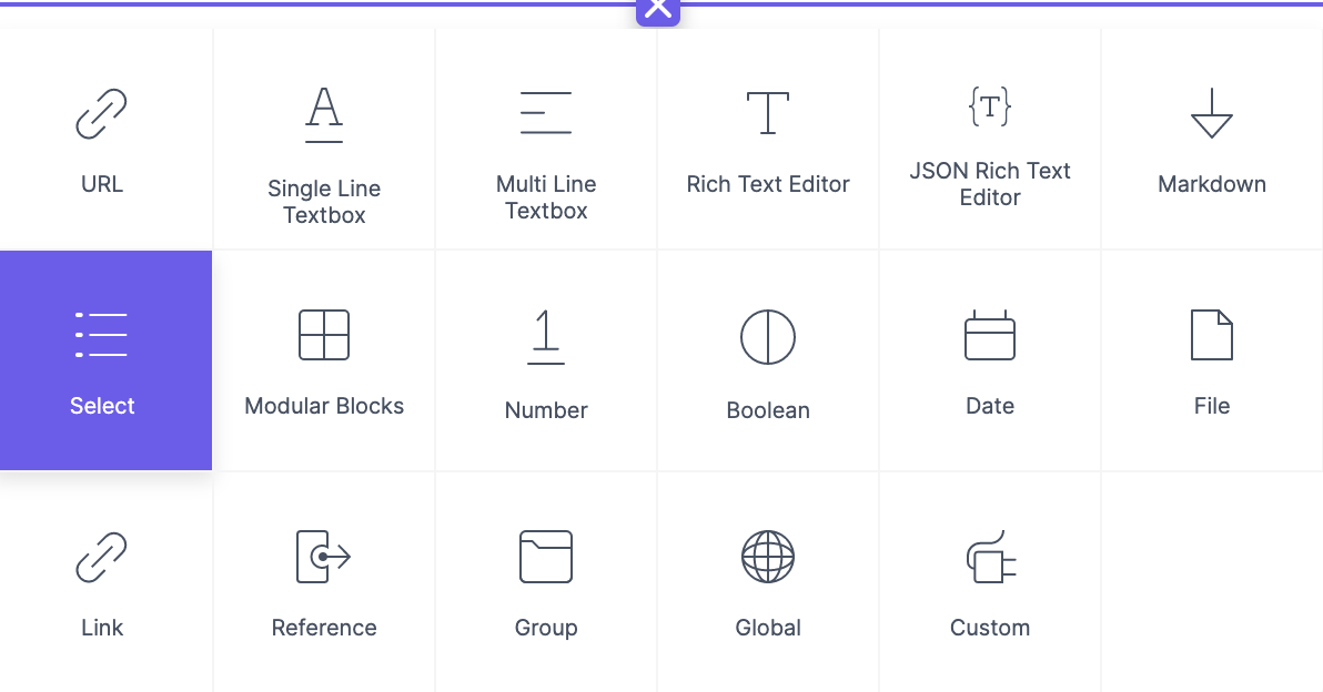
Select Field
The Select field allows users to choose one or more options from predefined choices. Configure this field as a Radio button, Checkbox, or Dropdown menu.
Understanding with an example
Single-value choices - You can add options containing simple values.
Example: For eCommerce, allow someone to pick a shirt size from XS, S, M, L, or XL.Key-value pair choices - You can enable the Key-value pairs option and add key-value pairs separated by a colon (:). A comma separates every choice. Only the key name is displayed on the entry page, while the value is stored in the backend database for reference.
Example: You might want to specify a state's code while defining choices in a government website so that we can specify key-value pairs such as New York:NY, Texas:TX, and Dubai:DBX.
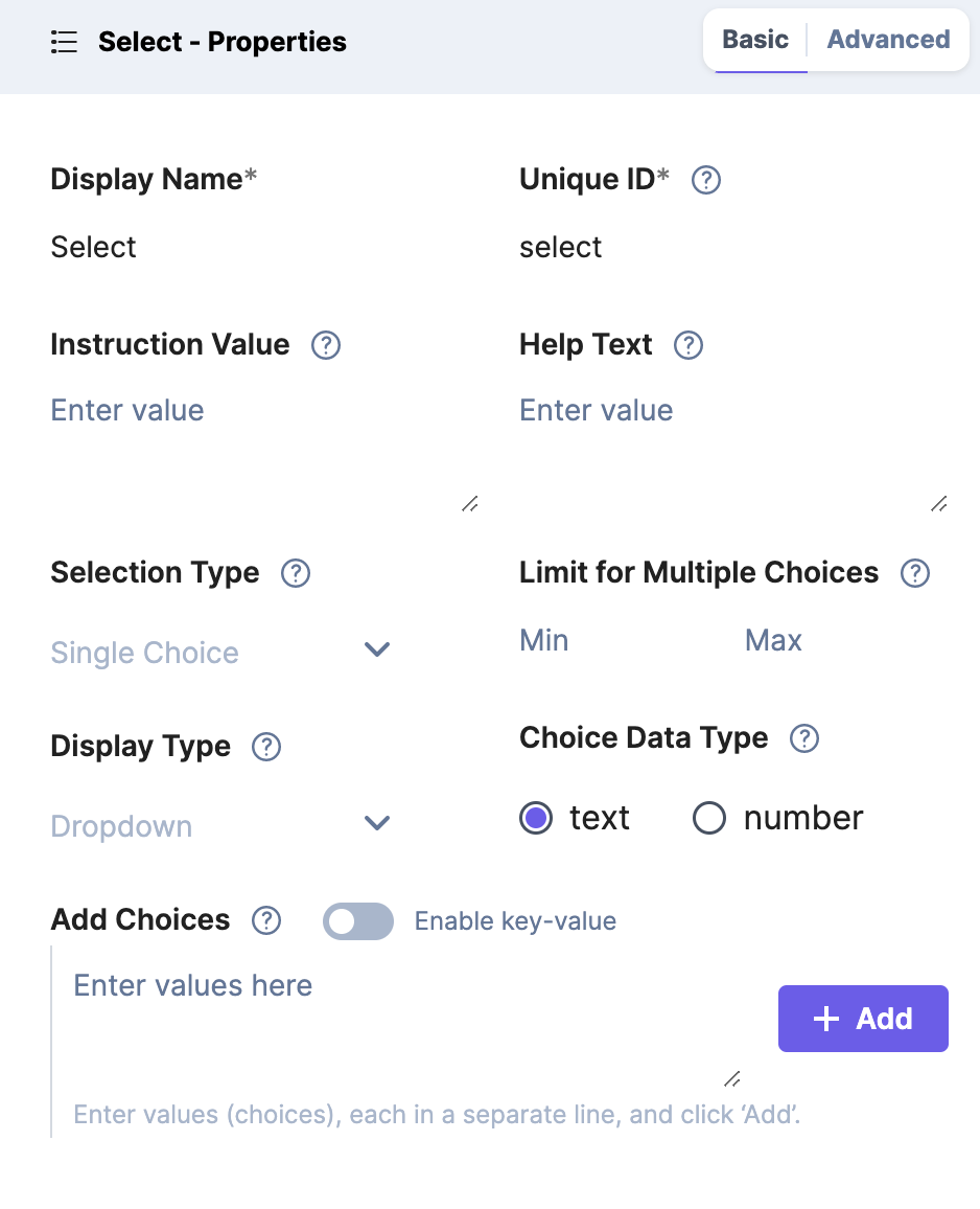
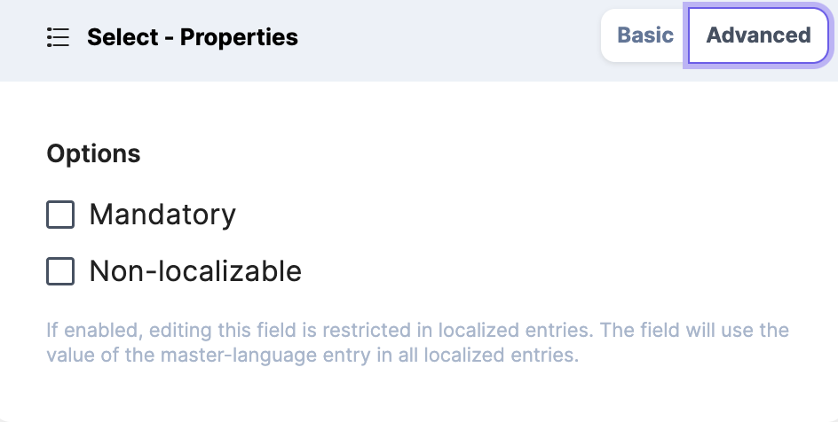
The properties that can be modified are:
Basic
Display Name
Unique ID
Instruction Value
Help Text
Selection Type
The limit for Multiple Choices
Display Type
Choice Data Type
Add Choices
Advanced
Mandatory
Non-localizable
You can add up to a max default count of 100 choices for a single dropdown menu.
A key-value pair option can contain a maximum of 100 characters in length.
Enabling or disabling the Enable key-value button erases your existing choices. Proceed with caution to avoid any loss of data.