Introducing the New Contentstack
Welcome to the new Contentstack — a revolutionary way to create and manage content.
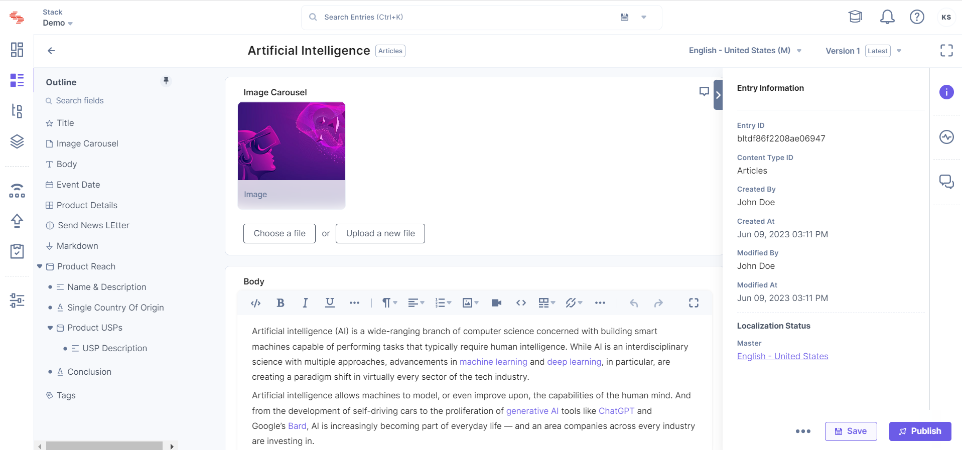
We have rebuilt our product from the ground up to make the content creation experience with a focus on doing one thing: Improve the core features to make them easier to use and more intuitive for both content managers and developers. This document explains some of the major changes that the new Contentstack brings to you:
What's New
- Fresh look and feel
- New navigation menu
- A better way to search
- Easy content modeling
- Access and create entries the new way
- Improved RTE
- Smarter asset management
- Helpful dashboard widgets
- Single and bulk actions in Publish Queue
- Integrated GraphQL API explorer
- Optional URL field
Fresh look and feel
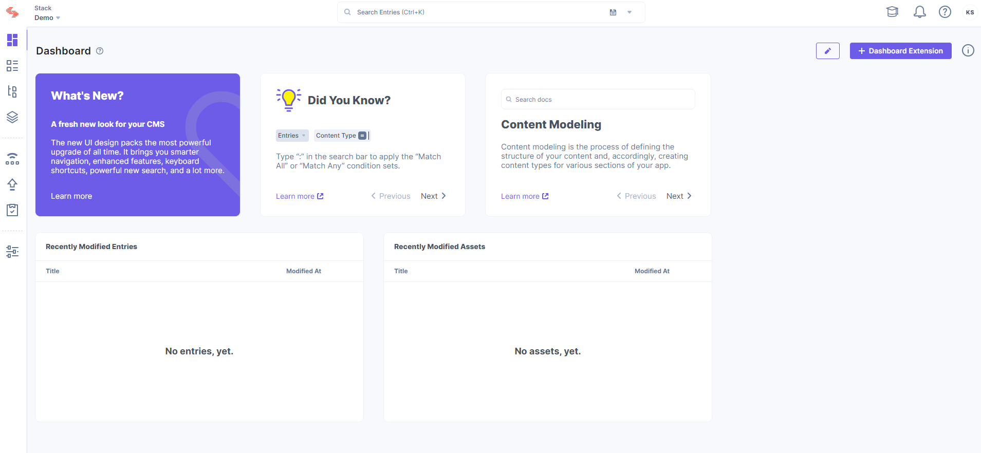
We changed our color palette and have used a bold and energetic purple to give the interface a more refreshing look. We updated the interface with new fonts, icons, styles, and additional whitespace to modernize the look and streamline the data presentation. Overall, the new interface is designed so it’s more pleasing and comfortable to the eyes when working longer hours.
New navigation menu
The main navigation bar now appears on the left side of the page. This new position makes scanning navigation items easier (as we often read in an F pattern) and delivers more scalability. The navigation items now have icons that enhance the interface’s aesthetic appeal and help you navigate faster through easy recollection.
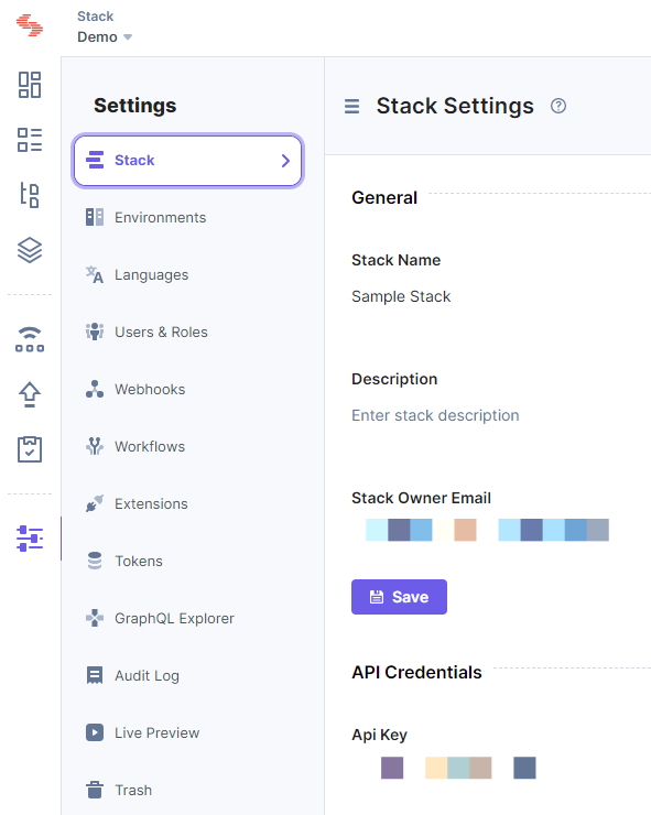
The secondary navigation panel also acts as a filter for many modules, narrowing down search results.
A better way to search
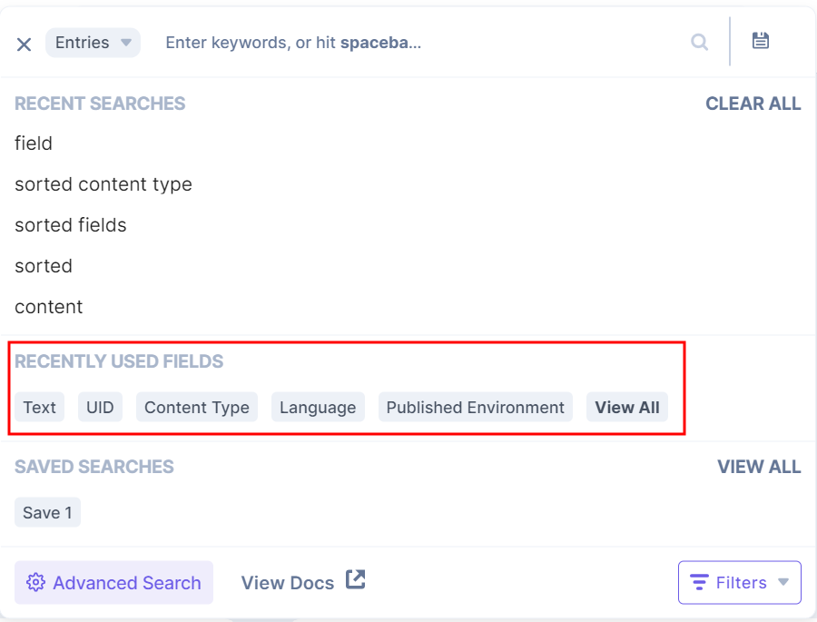
We improved search with more power and functionality, so you can find even the tiniest needle in the haystack. The new "Recently Used Fields" option in the search dropdown allows you to select from a variety of frequently used fields.
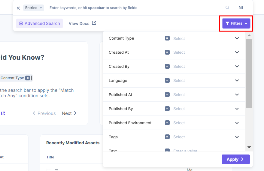
Another new addition to the search dropdown panel is the “Filters” option. It lets you narrow down your search by adding queries without having to switch to the advanced mode.
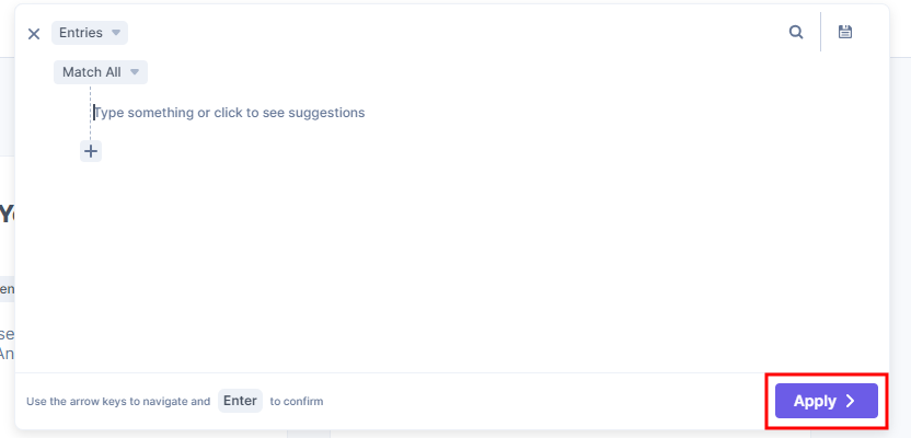
You can perform complex search queries anytime by hitting the “:” key and adding multiple condition sets before clicking “Apply.” We have overhauled the advanced search experience to make it more flexible and scalable.
Read more about how search works in Contentstack.
Easy content modeling
A new module called “Content Models” has been added. It consists of “Content Types” and “Global Fields,” since both help you model the structure of your digital property. Additionally, we have simplified the way developers build content types or global fields. Instead of the legacy drag-and-drop design, our builder page now features a cleaner design with more whitespace, a new way to add and move fields, and simplified filtering. Just click on the “+” icon anywhere on the builder page to add a new field.
Access and create entries the new way
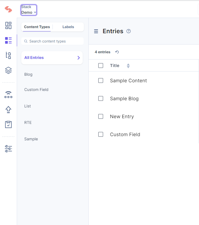
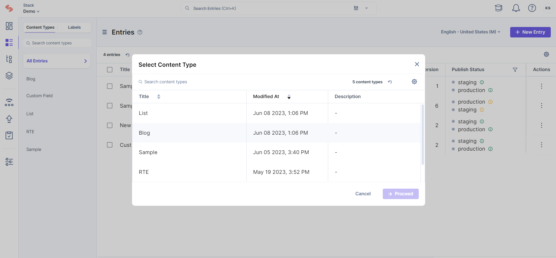
“Entries” now have a new and dedicated home and are no longer part of the broader “Content” menu, making it easier for content managers and new users to navigate to individual content pieces. You can filter entries by content type or view all entries sorted by newest entry first.
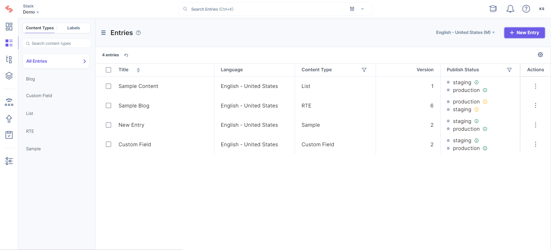
While on “All Entries,” you can select the content types for which you want to create a new entry.
The entry editor also has a cleaner look. The right-hand sidebar, now icon-based for a sleeker look, combined with more streamlined fields means more space for content managers, so they can focus on just creating content. The outline of fields that appears when you hover over the left side makes it easier to jump between fields, especially while working on lengthier content.
Improved RTE
We improved our RTE field as well. The underlying functionality remains the same but the look and feel is refreshing. You will notice that the performance has definitely improved immensely.
Smarter asset management
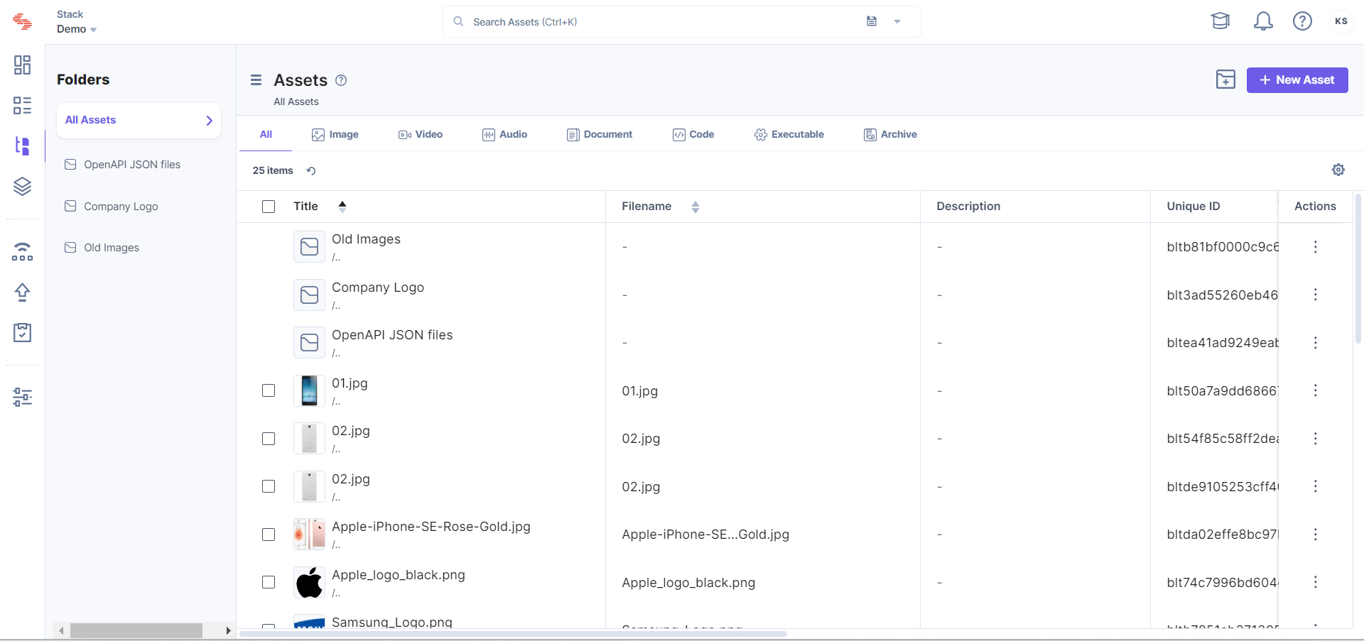
You can now view assets by folder or by their type.
Helpful dashboard widgets
To liven up your stack dashboard, we introduced some cool widgets that will be available by default for all stacks: What’s New, Quick Help, and Did You Know. Users can add or remove these widgets with a single click.

Single and bulk actions in Publish Queue
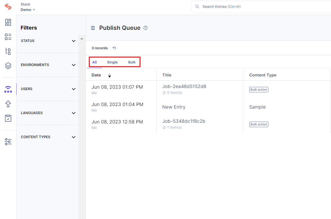
We separated the single and bulk tasks in Publish Queue, so your single items are not buried under bulk tasks (or vice versa), and you can track both easily.
Integrated GraphQL API explorer
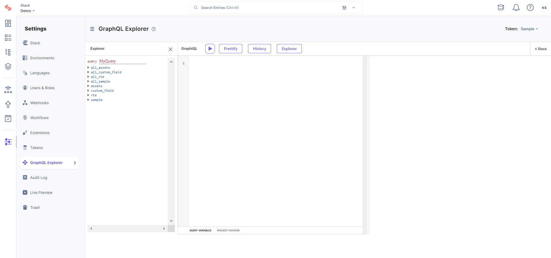
The GraphQL IDE is now embedded, so developers can try out our GraphQL Content Delivery APIs with their actual stack data.
Optional “URL” field
While creating content types, you no longer have to choose between the “Webpage” and “Content Block” options. It’s just “content type”. The “URL” field doesn’t come as a default field in the content type body, but is available as a field that you can add to your content types, if required. So, if you intend to create a content type for a web page, add the “URL” field, else you can skip adding it.
This means that users who want to create webpage content type will have to manually add the URL field into their content types and will not find it by default.
More features
The changes listed above are just a few of the many exciting new additions to Contentstack. We made numerous other improvements — “comfortable” or “compact” view for lists, the ability to “star” stacks, and being able to refresh a list of items — you will find improvements everywhere. As a Beta user, please try out the new Contentstack as much as possible and let us know what you think.
Keyboard Shortcuts
Contentstack has provided a list of keyboard shortcuts that will provide you with an alternative way to directly access certain Contentstack modules in our new interface.
You will be able to see the shortcuts in a tooltip when you hover over a module.
Help Us Improve
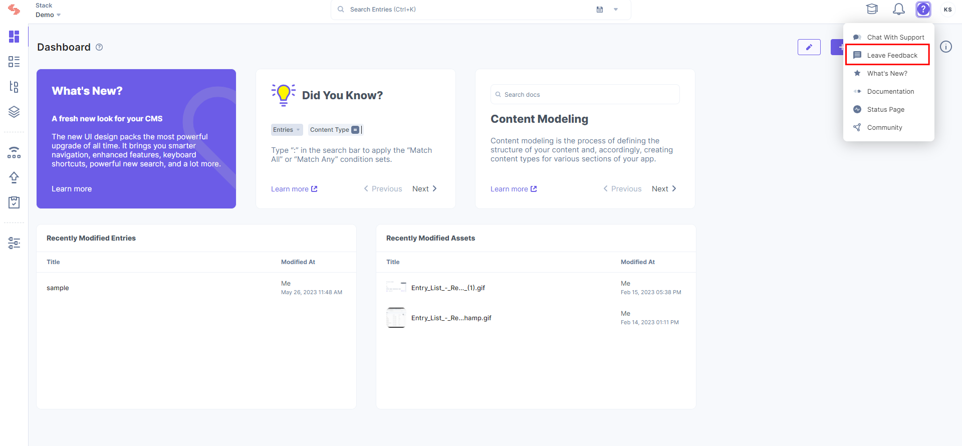
We are eager to hear what you think of the new Contentstack. If you have feedback on any enhancements, please submit it by clicking the question mark (?) on the screen’s top-right corner and then click on “Leave Feedback."
Thank you!


.svg?format=pjpg&auto=webp)


.svg?format=pjpg&auto=webp)
.svg?format=pjpg&auto=webp)
.svg?format=pjpg&auto=webp)
.svg?format=pjpg&auto=webp)


