
.svg?format=pjpg&auto=webp)
.svg?format=pjpg&auto=webp)
.png?format=pjpg&auto=webp)

.svg?format=pjpg&auto=webp)
.svg?format=pjpg&auto=webp)
.svg?format=pjpg&auto=webp)
.svg?format=pjpg&auto=webp)

.svg?format=pjpg&auto=webp)
.svg?format=pjpg&auto=webp)
.svg?format=pjpg&auto=webp)


.svg?format=pjpg&auto=webp)
.svg?format=pjpg&auto=webp)
.svg?format=pjpg&auto=webp)
.svg?format=pjpg&auto=webp)

.svg?format=pjpg&auto=webp)
.svg?format=pjpg&auto=webp)
.png?format=pjpg&auto=webp)
.svg?format=pjpg&auto=webp)
Preview Content across Varied Window Sizes
Contentstack’s Live Preview allows you to test and validate how your content responds to different screen sizes and orientations. This ensures your content is optimized for various devices, including desktops, tablets, and mobile phones.
To preview your content, log in to your Contentstack account and perform the steps given below:
- Go to your stack and click the “Entries” icon in the left navigation panel or use the shortcut key “E” (for both Windows and Mac users).Note: Make sure to enable Live Preview in your stack, configure the base URL, and select the desired environment (development, staging, or production).
- Select an existing entry and click the Live Preview icon.
- Drag the edges of the preview panel to resize it manually. This lets you observe how your content adapts to custom window sizes.
- Click the Open in New Tab icon in the top-right corner of the Live Preview pane to view your content in a dedicated browser tab. This provides more space for testing and is ideal for detailed validation.
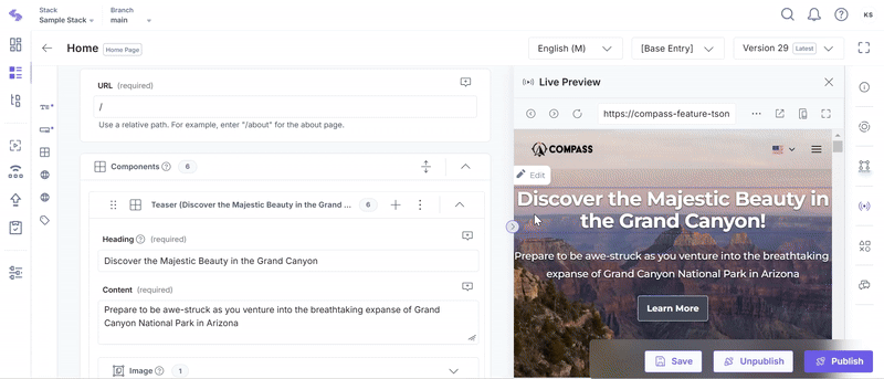
- Use the Toggle Orientation button to switch between landscape and portrait views. This feature lets you simulate different viewing perspectives for each device.
By leveraging these features, you can ensure your content is fully responsive and delivers an optimal user experience across all devices.
Was this article helpful?
More articles in "Work with Live Preview"
