Preview Content across Multiple Channels
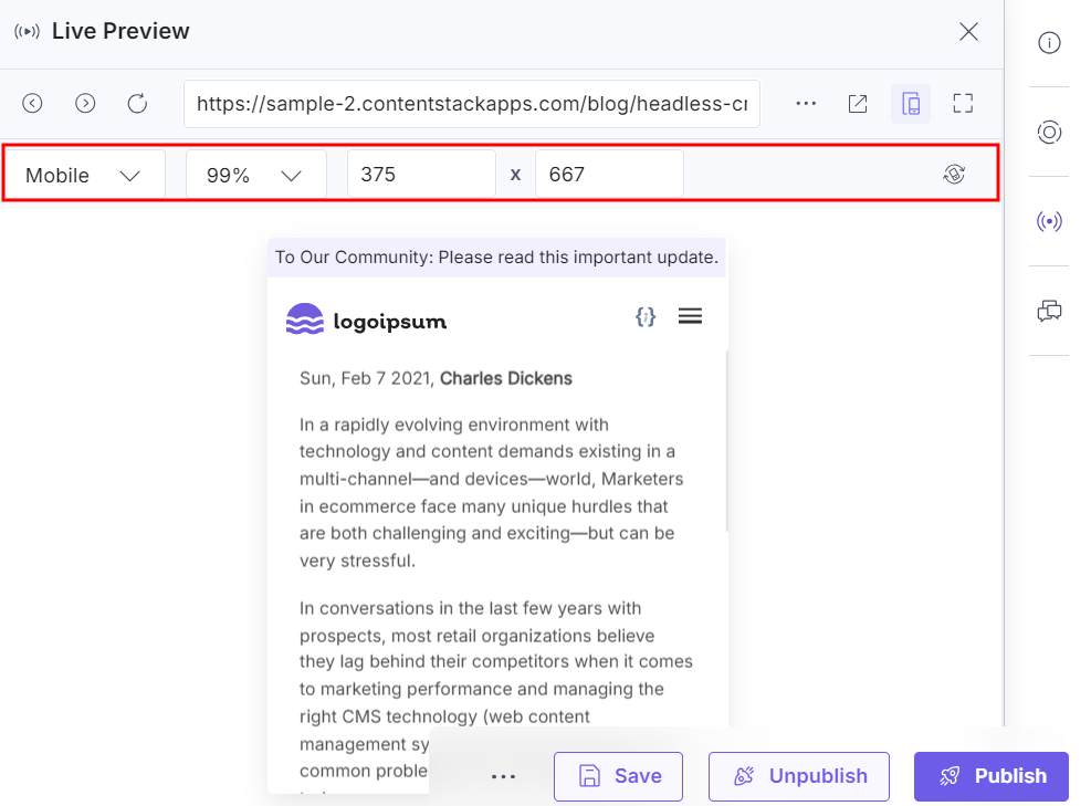
Previewing content across multiple devices ensures your audience experiences seamless and optimized interactions, regardless of the platform they use. With Contentstack, you can validate how your content appears on desktops, tablets, and mobile phones. This functionality allows you to adjust and perfect your content for diverse screen sizes and orientations.
To preview content across multiple channels, log in to your Contentstack account and perform the steps given below:
- Go to your stack and click the “Entries” icon in the left navigation panel or use the shortcut key “E” (for both Windows and Mac users).Note: Make sure to enable Live Preview in your stack, configure the base URL, and select the desired environment (development, staging, or production).
- Select an existing entry and click the Live Preview icon.
- Use the Toggle Orientation button to swap between landscape and portrait views. This feature helps you visualize how your content will appear in different orientations.
- Modify the aspect ratio within the preview panel to ensure your content is responsive across various screen sizes.

Note: The default aspect ratios for Mobile and Tablet devices cannot be edited in the preview window.
By following these steps, you can preview, validate, and fine-tune your content for multiple platforms, ensuring a polished and consistent user experience across channels.


.svg?format=pjpg&auto=webp)
.svg?format=pjpg&auto=webp)
.png?format=pjpg&auto=webp)


.png?format=pjpg&auto=webp)