Development of an Augmented Reality Retail Skin Care POC: Content Modeling and Interaction Building (Week 2/3)
Week Two: Content modeling for AR; final designs; selecting and programming marker tracking movement patterns and text display parameters.
Welcome to the reality of building an augmented reality demo. This is the second-to-last week of our "live" project documentation (find week zero here, and week one here), and this week we moved away from designs and theory and into hands-on development on all fronts of this project.
In this week’s post, you can read about:
As a summary, we have decided to build the following: A mobile web-browser Augmented Reality (AR) experience to be used with a brand’s skin care products -- for the purposes of this POC, we are focusing on the skin care category of serums. It will help the customer to select the best serum for them in the store; to receive onboarding instructions and personalized recommendations when first using it; and after using it for a while, receive updated recommendations and information.
First up this week: how to actually get all this information into our AR experience.
Headless CMS content modeling for Augmented Reality
In order to provide a content-rich AR experience to our users, a lot of data (brand and product names; product textures; ingredients’ purpose, source, contraindications; usage instructions) must be stored in our CMS (Contentstack) to be easy to query (so it shows up the way we want, at the speed we need, and prepared for personalization), and easy to edit or modify (because products get added; names change; instructions get updated; new ingredient configurations and contraindications happen).
The process of documenting all the types of content you’ll need for an experience (whether AR, VR, mobile app or website) and putting it into logical buckets to ensure your CMS is effectively configured for editing and delivering that content to that experience (or many experiences) is called content modeling. (Here’s a primer we’ve written on this topic.)
With traditional content management systems, which have been designed for building web pages, this is a pretty straightforward process. You basically have a few ways you can organize things: folder structure can reflect your site pages, or it can reflect content types (elements of a webpage like banners, images, forms, text; repeating formats like blog articles, press releases, customer testimonials, and so on). Then it’s just a matter of giving editors page templates that allow them to mix and match these content types within certain identifiable limits. Or in some cases, the CMS even comes with static templates that can’t be customized or made more flexible at all. This is based on the assumption that because there are only a few, relatively predictable ways that this content is going to be used for all customers of that CMS, that it’s easier for everyone to pre-define the content models.
When it comes to headless systems, though, things are a little bit more fluid. Especially for a CMS like Contenstack that was designed to be as un-opinionated as possible about where that content is going to end up. While you can have (and we do provide) lots of solid guidance on specific examples for different industries and use cases, at the end of the day, your content model is going to be hyper-unique to your organizations’ ways of working and ways of delivering your content.
As it turns out, this is actually a good thing when it comes to building out Augmented Reality content models.
Benefits of a headless system for Augmented Reality
Ben Ellsworth, Solutions Architect at Contentstack, says that headless CMS is somewhat of a no-brainer for developing AR experiences precisely because of its flexibility, or lack of opinion about where your content is going to go. He explains:
"There isn’t a long-standing tradition of AR and VR applications, and there’s no solution that is pre-built for the problems that an enterprise is going to experience when they’re developing for AR. When you’re trying to do something uncharted, you cannot let yourself be limited by something that was built with “websites” in mind.
Contentstack is extremely agnostic to the display and dynamic in the way it relates content to the display layer, so that you can architect the data and the content structure in the best way for where it’s going, no matter what the end goal is.”
“You’re only constrained by the limits of today’s technology,” adds Gal Oppenheimer, Manager, Solutions Architects at Contentstack. “So, in the case of AR: what can the phone browser do, and what can the cameras do? Those are actually our constraints, because that’s where we’re pushing the boundaries in terms of what technology allows us to do today.”
Content modeling: Identifying, classifying and uploading content
What did content modeling for our AR experience actually look like?
Step 1: What content is there?
First, we had to figure out all the different kinds of content that it might want to use.
To do that, we had to research some serums so we could know what kind of information exists about them. We found this site particularly useful for discovering the purposes of product ingredients.
.gif)
Step 2: Extrapolating - what are the content types that we might need?
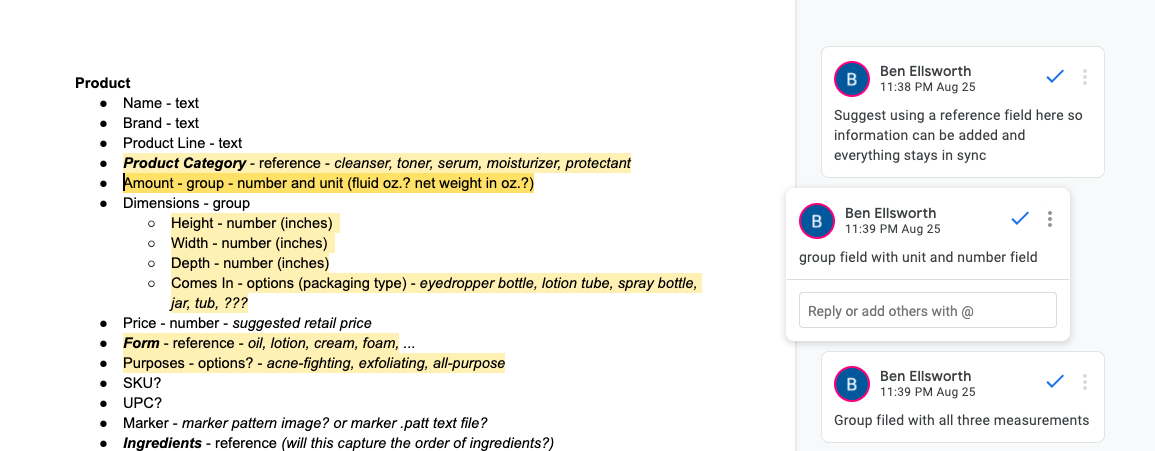
In this step, we listed every kind of content that we could identify about skin care products that might be relevant to our purposes. We laid this out in a document with hypotheses for the way that we could structure these in the CMS (text, group, reference, etc.)
The Contentstack team consulted with the Valtech team on how best to structure this content in the most useful way.
Sidebar: Flexibility vs Ease of use
The biggest question that comes up when designing content models in headless CMS is whether for a given scenario, more flexibility would be better, or whether some rigidity would actually better serve the end users (editors). Ben explains:
"There is a point of diminishing returns where additional flexibility ends up being detrimental to productivity. When a content creator has access to 1,000 options for structuring a piece of content, they have to make 1,000 decisions every time they create a piece. This is an extreme example but with a headless content management system, the person modeling the content does have the power to create an infinitely flexible system.
“As you model your content, ask yourself why you’re giving the editor the options you are.
“For example: in our application, we were deciding between using a group field or a modular block for the product usage instructions. The modular block would allow editors to move the instructions to any place in the AR content display. However, because we would only ever need one set of instructions, and the single set would need to be mandatory, we went with the group field. It has most of the benefits of a modular block without the unnecessary features like multiple instances.
“On the flip side, we had originally considered using a simple drop-down to choose product categories. In a non-headless system, this would be par for the course since the editor needs to be able to pick between many options for each product. With a headless system, we can do better and use reference fields. This lets us create a whole new content type for the categories where we can store their names as well as additional information like descriptions, links, and images. We then let the editor reference that field in the product content type. If we need a new category added to the list, we don’t have to change the content model directly, which would require a higher level of access in the system that could break other processes. We simply create a new entry of the category content type and it will automatically be available to all product entries.”
Step 3: Input the content for the AR experience into the CMS
With decisions on the content types made, it was time to build out and populate our content model. To do that, we had to create some serums! We did this by taking inspiration from the real serums that we researched in step 1, and coming up with some ingredient combinations and usage scenarios of our own.
.gif)
We entered the content data into the CMS. This part was pretty straightforward, since we were following the model that we had already laid out. The bonus aspect of this is that now, when a brand wants to build out an AR experience like this for their products, the content modeling has already been done. So we’ve got a template to work with in the future (of course, customized to their particular use case). Below, you can see some examples from the live stack!
Step 4. Querying the database
The last step was figuring out how to get data out of Contentstack and into the AR experience. Contentstack has two ways to retrieve data via our Content Delivery Network (CDN), and the team wanted to test both of them. So Valtech wrote a quick sample that pulled down the data we entered (as JSON) from each in turn. They decided to use the new GraphQL API because of the simplicity of queries, and because it returned fewer data properties. They then added an additional function to process the response JSON to simplify the object structure — removing extra nesting on reference field JSON, rearranging how the data was organized in the response from the API — so that it was more easily and efficiently consumed by the AR code they were already writing.
Designing what the live experience will look like
Following last week’s progress on creating sketches and comps for how to display the AR information around the product bottle, this week Svante (our designer) worked on figuring out what the whole AR experience will look like. That meant going beyond the “augmented” part of information display and marrying that with the “reality” side of things.
For Scenario 1, shopping in the store, we created a way to hone in on a particular product while in a brightly-lit, colorful shop. As you can see in the graphics, the idea was to darken and blur the background (more on how we developed this below) and zero in on exactly the product that the customer wants to see more information about.
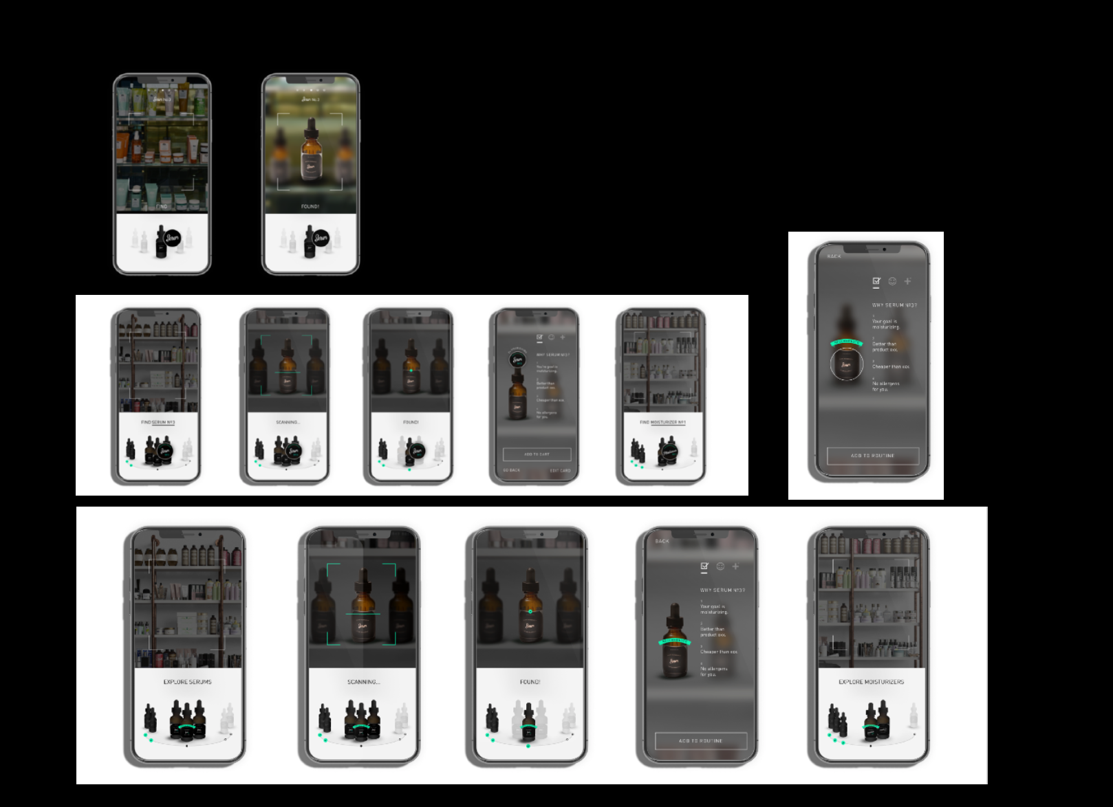
For Scenarios 2 and 3, a similar “darkening” effect was applied so it would be easier to see the displayed information no matter what kind of colorful or distracting bathroom the user might be accessing the experience in!
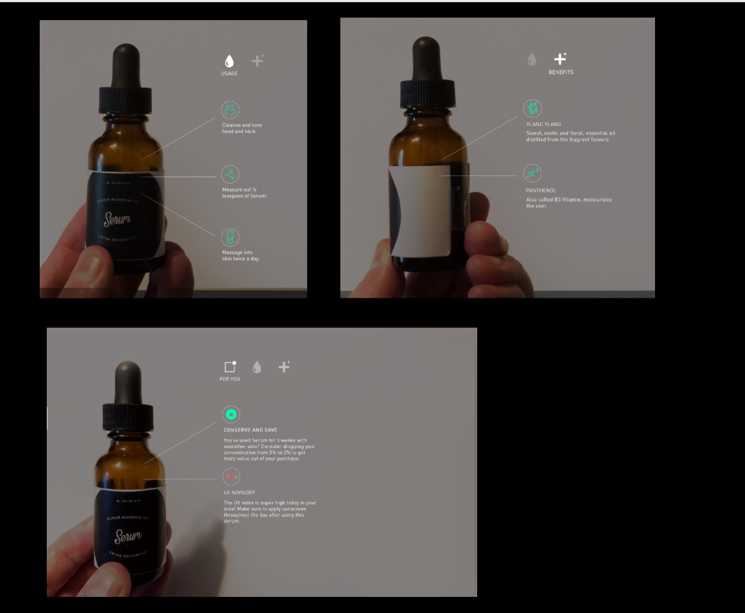
Then it was over to the developers to figure out how to actually make all of this happen.
Developing the live interaction
This week, the development focused on three major elements of the AR experience that we need to nail down for this POC:
- Finalizing what the fiducial markers will look like,
- Figuring out exactly how we’re going to track those markers to create the best user experience, and
- Figuring out how the AR elements will be displayed, including the background dimming effect
1. Fiducial markers: smaller & customized
Last week we figured out that fiducial markers (those black square things) would work best for this POC as they were the easiest for our AR framework to latch onto. But we also want our product to be as pretty as a skin care label usually is, so we tried to see if we could shrink those markers down for more design flexibility. The standard size is 1 inch, and we were able to get them down to 0.5 inch and still have them tracking the bottle movement - in all 3 axes - really well.
.gif)
We also tested creating custom markers, which is of course going to be crucial for designing stylish skin care bottles. These also worked - in fact, in some cases they worked better than the standard markers.

Custom “umbrella” fiducial marker.
2. What’s the most user-friendly way to display AR content in response to markers in motion?
We tested different ways of spinning and tilting the bottle to display what was being shown on-screen. Alex Olivier explains that her main concern - other than supporting natural hand movement - was to lower the risk of the marker getting lost. “In many AR experiences, the content disappears entirely if the marker is lost for a second, which I think is a mistake,” she says. For this reason, the most compelling motion they found for the bottle-as-controller was a rotation around its own axis.
A big decision point at this stage was how to display the content that would be controlled by rotating the bottle to detect multiple markers. The team created a system to have keyframe rotations around a 3D layout and then animated / interpolated as different markers were detected. “We had to dust off our trig books!” says Alex.
.gif)
Using this rotation motion (instead of a back-and-forth tilt, for instance), we are lowering the risk of losing the marker, allowing the content to persist in a natural way, and making it more likely that the final user experience will be seamless.
.gif)
3. Maximizing AR element visibility for a content-rich AR experience
Here’s something we learned about content-rich AR experiences, from Alex:
“Displaying text (and doing it beautifully) is difficult in computer graphics. You need text to look good at multiple scales and at multiple distances and from multiple angles! That’s why we ended up generating a signed distance field font, which is a bitmap font (but a special one) that uses signed distance fields to beautifully raster text. (You can read more about it here.)
“The other thing about text in 3D graphics is that unless you’ve written yourself some handy library, you’re having to do all of the content layout manually. There are a few basic features that were available to us (e.g. alignment of text), but a lot of the work involved flat-out building the layouts that Svante had designed and calculating where to put text & writing functions that could generalize this so it wasn’t 100% hard-coded. If you’re used to slinging CSS or using nice built-in iOS features, you may not appreciate the effort that goes into text in graphics… and now you know why you rarely see text-rich AR apps!”
The last element we built out this week was making Svante’s cool darkened-background design come to life. Alex explains, “to do a blur, the most efficient way to do it is usually to use a “shader”, which is a program you run on a graphics card. You take a texture or an image and you pass it through that shader, where all the pixels get transformed.
“There were some tricks to this for plugging everything involved in this into AR.js via A-frame: for example, making sure the blurred area is always the same size as the webcam screen, which involved transforming those vertices to be a certain size. It wasn’t necessarily difficult - but it was a lot of things to learn in a short amount of time.”
Despite these challenges, we were able to get this working by the end of week two, which was a win!
.gif)
P.S. Tip for all AR developers: ngrok.io turned out to be invaluable for helping us test things out on our phones. Before we discovered it, running code on the phone required a pretty complex choreography of copying over security certificates. ngrok lets you run an HTTPS server on your local computer that can be easily accessed from anyone on the internet, with the proper security settings for AR to work, which made testing so much faster.
Check out Week 3: It all comes together! The pieces we’ve been tracking thus far (content, design, and development) must all integrate with each other into one working demo.
About Contentstack
The Contentstack team comprises highly skilled professionals specializing in product marketing, customer acquisition and retention, and digital marketing strategy. With extensive experience holding senior positions at renowned technology companies across Fortune 500, mid-size, and start-up sectors, our team offers impactful solutions based on diverse backgrounds and extensive industry knowledge.
Contentstack is on a mission to deliver the world’s best digital experiences through a fusion of cutting-edge content management, customer data, personalization, and AI technology. Iconic brands, such as AirFrance KLM, ASICS, Burberry, Mattel, Mitsubishi, and Walmart, depend on the platform to rise above the noise in today's crowded digital markets and gain their competitive edge.
In January 2025, Contentstack proudly secured its first-ever position as a Visionary in the 2025 Gartner® Magic Quadrant™ for Digital Experience Platforms (DXP). Further solidifying its prominent standing, Contentstack was recognized as a Leader in the Forrester Research, Inc. March 2025 report, “The Forrester Wave™: Content Management Systems (CMS), Q1 2025.” Contentstack was the only pure headless provider named as a Leader in the report, which evaluated 13 top CMS providers on 19 criteria for current offering and strategy.
Follow Contentstack on LinkedIn.





.svg?format=pjpg&auto=webp)
.svg?format=pjpg&auto=webp)
.png?format=pjpg&auto=webp)


.png?format=pjpg&auto=webp)
.jpeg)

